GRACE.
Visual Identity Guidelines
Gender-based Violence, Restorative Ambassadorship for Correctional Environments. Official brand and communication standards.
GRACE is a European initiative advancing restorative, trauma-informed responses to gender-based violence within correctional environments. The programme works alongside institutions, practitioners, and survivors to support accountability, rehabilitation, and safer reintegration. This manual defines the official visual identity, its construction, and the standards governing its use.
- 01Brand OverviewMission, purpose, values, voice
- 02Primary LogoOfficial lockup and approved versions
- 03Construction & Clear SpaceGeometry, spacing, minimum size
- 04Color SystemHEX · RGB · CMYK specifications
- 05Typography SystemPrimary, secondary, mono
- 06Logo VariationsHorizontal, stacked, icon, favicon
- 07Incorrect UsageWhat never to do
- 08Digital ApplicationsWeb, social, presentation, e-learning
- 09Print ApplicationsReports, banners, certificates
- 10Master Files & AssetsDownloadable brand library
A restorative response, built on collaboration.
GRACE communicates with the calm authority of a European institution and the warmth of a human-centred practice. The identity speaks of restoration, accountability, and dignity — never of punishment or surveillance.
To advance restorative, trauma-informed approaches to gender-based violence within correctional environments across Europe — supporting accountability, rehabilitation, and safer reintegration.
GRACE exists to equip institutions, practitioners, and ambassadors with the methods, language, and tools required to address gender-based violence in a structured, evidence-based, and restorative way. The brand stands for collaboration between justice systems, civil society, and survivors — and for the belief that rehabilitation and accountability are not opposites, but partners.
Repair before retribution. Programmes are designed to restore relationships, dignity, and trust.
Behaviour change is owned. Responsibility is named, supported, and structured.
Every voice is heard — survivors, practitioners, and those working to change.
Difficult conversations, held with care, in safe and structured spaces.
No person is reduced to their worst act. Every intervention preserves dignity.
Methods are grounded in research, evaluated, and aligned with European standards.
We speak of repair, never of punishment.
Clear, precise, evidence-led — appropriate for institutional contexts.
We address partners as equals: practitioners, institutions, survivors.
Language is gender-aware, person-first, and free of stigma.
We explain, define, and contextualise — never assume prior knowledge.
Every claim is sourced. Every promise is kept.
- Lead with people, not with crime. Centre survivors, practitioners, and those working to change.
- Avoid imagery of prisons, bars, weapons, handcuffs, or surveillance.
- Use the official logo and palette consistently across all partners.
- Pair institutional credibility with human warmth — never one without the other.
- Cite research, frameworks, and partners. Transparency is part of the brand.
- Write for a European audience: clear English, accessible language, inclusive terminology.
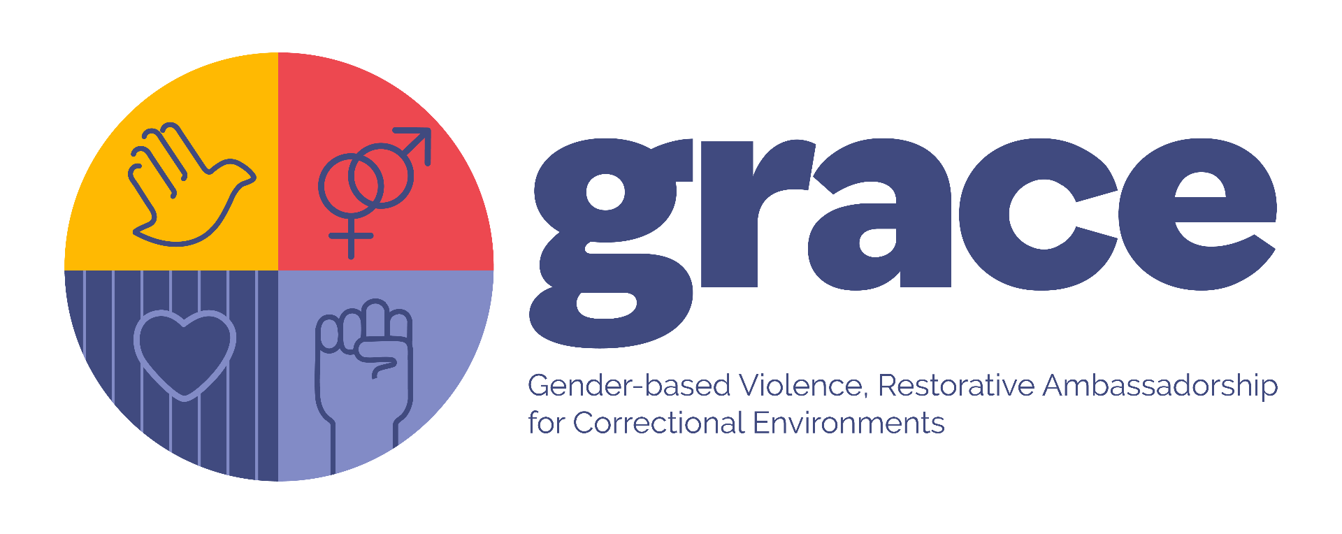
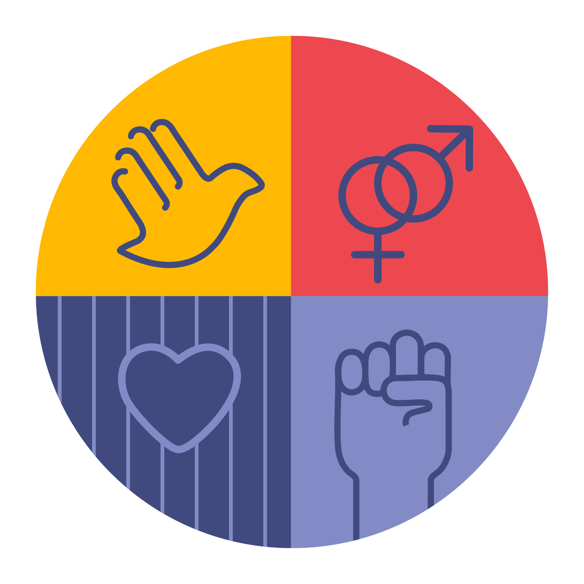
The official GRACE mark.
The official logo combines a circular emblem — divided into four quadrants representing dialogue, gender equality, dignity, and resilience — with the GRACE wordmark and full descriptor. It is the primary expression of the brand and should be used wherever possible.
Geometry, proximity, breathing room.
The GRACE emblem is built on a circle divided into four equal quadrants. The wordmark sits to the right at a fixed proximity. Around the full lockup, reserve clear space equal to the height of the circular emblem divided by four (x).
The emblem is constructed from a perfect circle divided into four equal quadrants. Each quadrant carries a distinct icon and colour, balanced around horizontal and vertical axes.
x = ¼ of the emblem height. Reserve this minimum margin on all four sides; never let text, images, or page edges intrude into the clear space.
Always align the logo to the top-left of layouts, or centre it on covers and certificates. The wordmark baseline aligns to the vertical midpoint of the emblem. Never rotate, italicise, or reposition the descriptor relative to the wordmark.
A balanced institutional palette.
The GRACE palette is drawn directly from the four quadrants of the emblem. Institutional Blue anchors authority and trust; red, yellow, and lavender signal energy, attention, and care. Neutrals carry typography and structure.
Used for the wordmark, headlines, and dominant surfaces.
- HEX
- #404A7F
- RGB
- 64 · 74 · 127
- CMYK
- 76 · 67 · 22 · 5
Used for accents, callouts, charts, and quadrant references.
- HEX
- #ED4850
- RGB
- 237 · 72 · 80
- CMYK
- 0 · 82 · 71 · 0
- HEX
- #FFB902
- RGB
- 255 · 185 · 2
- CMYK
- 0 · 30 · 100 · 0
- HEX
- #828BC6
- RGB
- 130 · 139 · 198
- CMYK
- 55 · 45 · 0 · 0
Used for paper, body text, and supporting structure.
- HEX
- #F4F1EB
- RGB
- 244 · 241 · 235
- CMYK
- 0 · 1 · 4 · 4
- HEX
- #1B1D29
- RGB
- 27 · 29 · 41
- CMYK
- 34 · 29 · 0 · 84
Institutional Blue on Paper meets WCAG AAA for body text. Action Red and Signal Yellow are reserved for accents and must not be used for body copy. For long-form text on dark grounds, use white on Institutional Blue.
Two voices, one institution.
Inter Tight carries the wordmark and the interface. Instrument Serif carries voice and editorial register. IBM Plex Mono is reserved for captions, metadata, and references. All three are open-source and licensed for unrestricted use.
abcdefghijklmnopqrstuvwxyz
0123456789 — & , . ; : ! ?
"Accountability and dignity are not opposites — they are the same conversation."
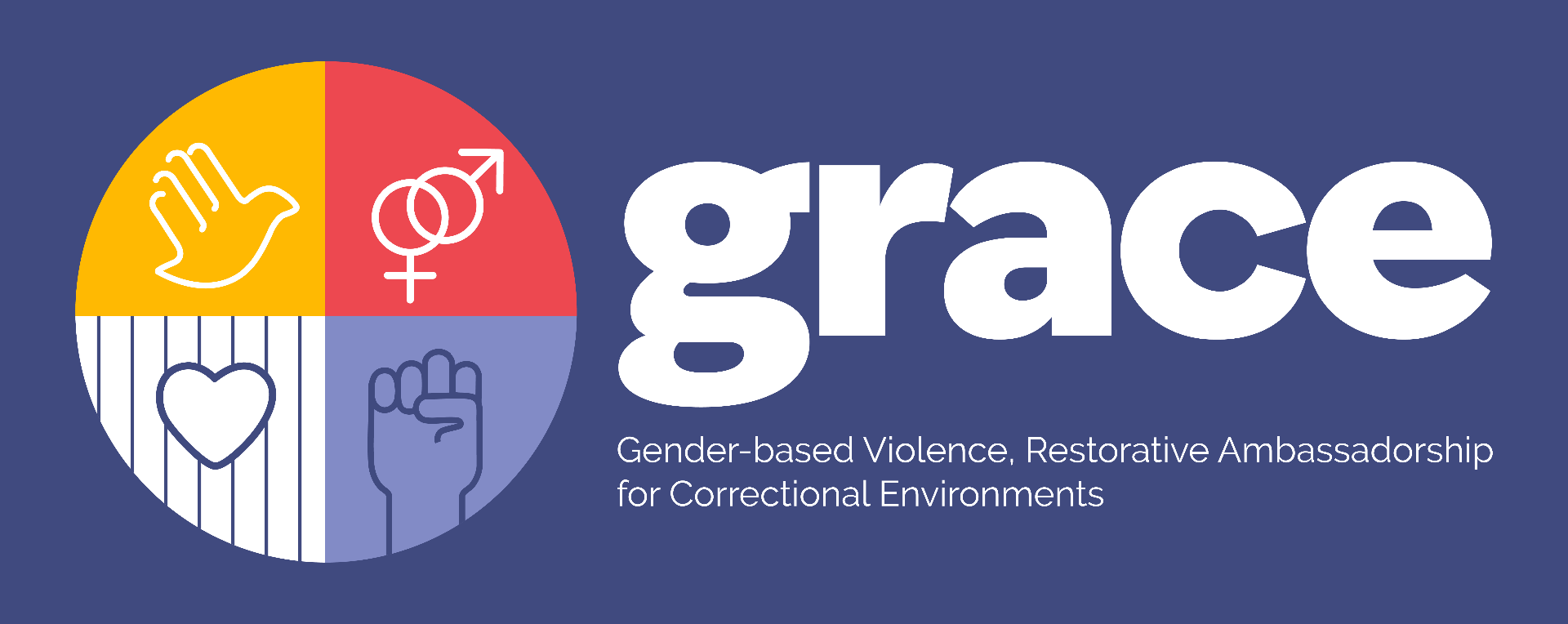
One identity, calibrated contexts.
Use the primary horizontal logo wherever possible. The white, monochrome, icon, and favicon variations exist for constrained surfaces, dark backgrounds, and single-channel reproduction.
What never to do.
The integrity of the mark depends on disciplined reproduction. The alterations below break the visual system and must never appear in any GRACE communication.
Web, social, presentation, e-learning.
Across digital surfaces, the GRACE logo anchors the top-left. Institutional Blue carries trust; the secondary colours signal action, attention, and care — never decoration.
A restorative response to gender-based violence.
Trauma-informed methods, evidence-led practice, European partnership.
Designing accountability conversations.
A structured approach to dialogue between practitioners and participants.
A roundtable on restorative practice.
Partner institutions wanted across Europe.
Methodology.
Trauma-informed, evidence-led, survivor-centred.
Working with correctional staff in restorative settings.
Annual indicators of restorative practice in EU prisons.
Reports, banners, certificates.
In print, the system holds its proportions. Covers use Instrument Serif at display scale; the logo and metadata grid are set in Inter Tight and IBM Plex Mono.
Policy brief
Toward a shared European standard for restorative correctional work.
A year of restorative practice across Europe.
A restorative response to gender-based violence.
Practitioner handbook for trauma-informed correctional work.
European Symposium on Restorative Correctional Practice
Awarded to [Participant Name]
For the successful completion of the GRACE programme in trauma-informed restorative practice within correctional environments.
The official asset library.
All official GRACE assets are versioned and centrally distributed. SVG is the master format — always prefer it where vector reproduction is supported. PNG variants are provided for surfaces that require raster files.
For partner co-branding, special formats, or printed swatch books, contact the GRACE brand custodians at sami.bogdan@cpip.ro. All files above are live downloads of the official GRACE visual identity.